More Is More
20x30 inches
Screen-printed Poster
Fit Devanagari, a typeface that expands to fill space, mirrors this cultural logic. It fits—not just formally, but conceptually. The poster challenges Western ideals of white space and minimalist design by celebrating a "more is more" sensibility.
The visuals of this project were deeply inspired by Indian "coaching class" visuals I see all the time when I'm back at home. They're usually very low production flyers, pasted everywhere on roads, telephone poles, and stalls.
Grass Between The Stones
18x24 inches
Map With Screen-printed Back
Chandigarh, my hometown, is India's first modernist city, built in the 1960s after the partition with Pakistan. It was meant to be a symbol of modernity, progress, and order through Western ideals.
This project is a meditation on the city of Chandigarh—designed by Swiss-French architect Le Corbusier. I was interested in the disconnect between modernist planning and the lived experience, between a low-context design system and a high-context society—reflecting on what is designed versus what is experienced.
This project involved a lot of research around the city's political history, its planning and architecture. To balance the theory with something more lived-in, I interviewed my parents. Their stories weren’t about architecture or policy, but about growing up — the rhythms of everyday life, what’s been lost, what’s stayed the same. Their version of the city didn’t always match the one in the books.
At some point, the project became a rant about a chair. The V-leg chair, designed by Pierre Jeanneret, was made for Chandigarh’s public offices and homes — functional, democratic, everywhere. But recently, they’ve been removed from the city, sold at Western auctions for thousands of dollars under the narrative that they were being "neglected." Somehow, this chair became a symbol of erasure and reclamation.
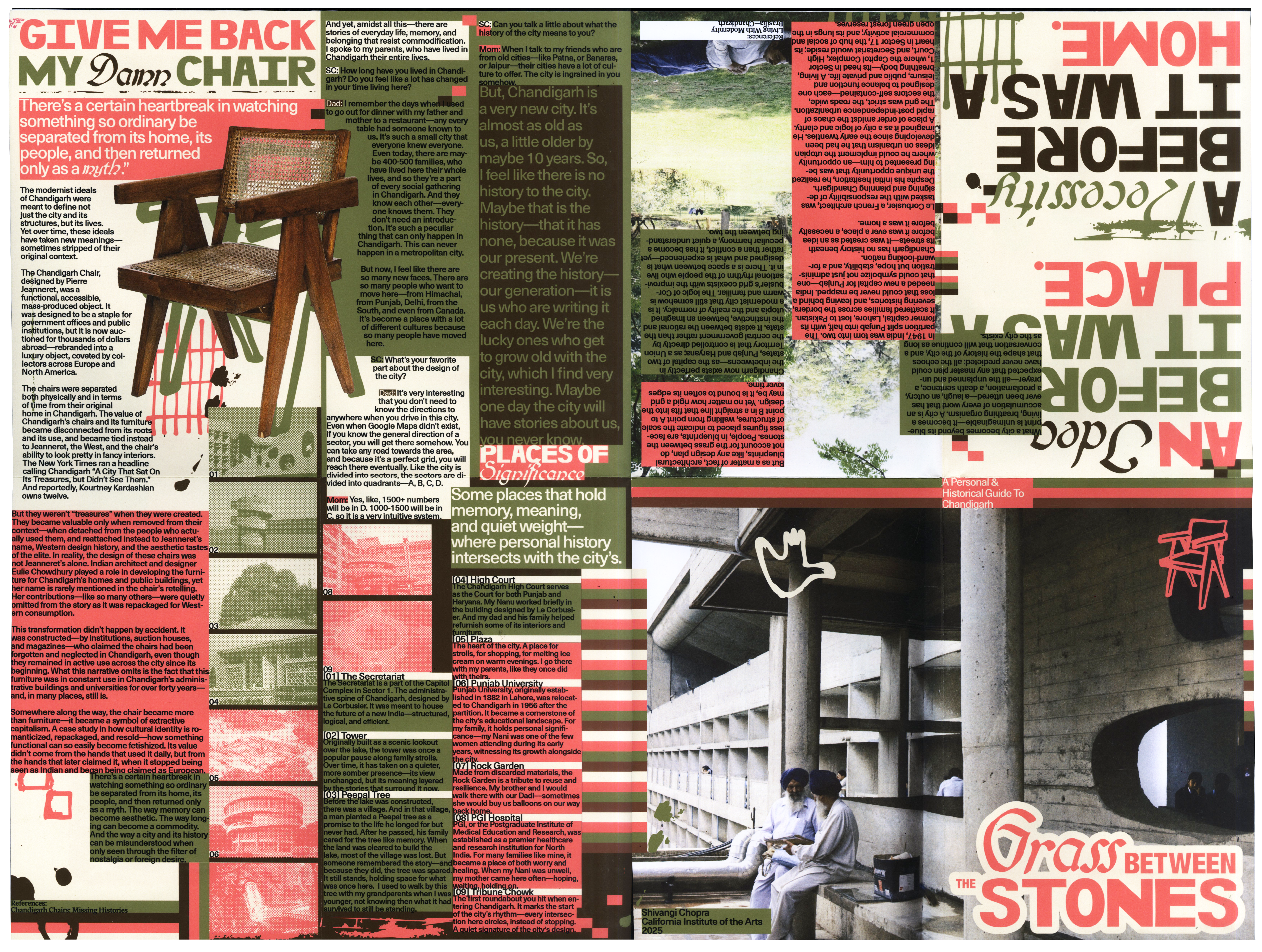
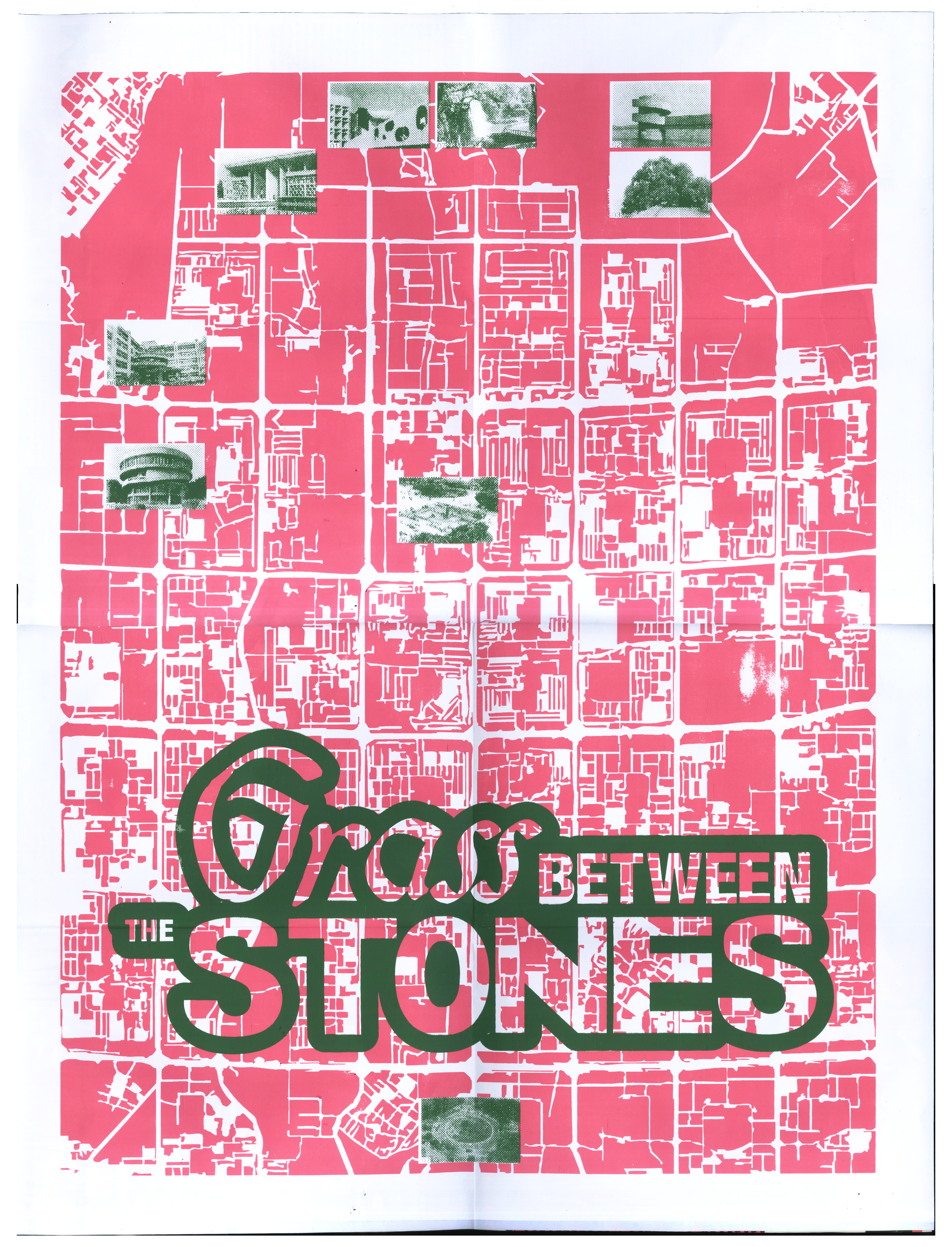
The screen-printed map on the back visualizes the city’s masterplan, where every intersection is a roundabout. The layout is rigid, utopian, and strangely beautiful. In the end, this piece became about preservation — of memory, of stories, of objects. It’s about what gets remembered, what gets exported, and what gets left behind.
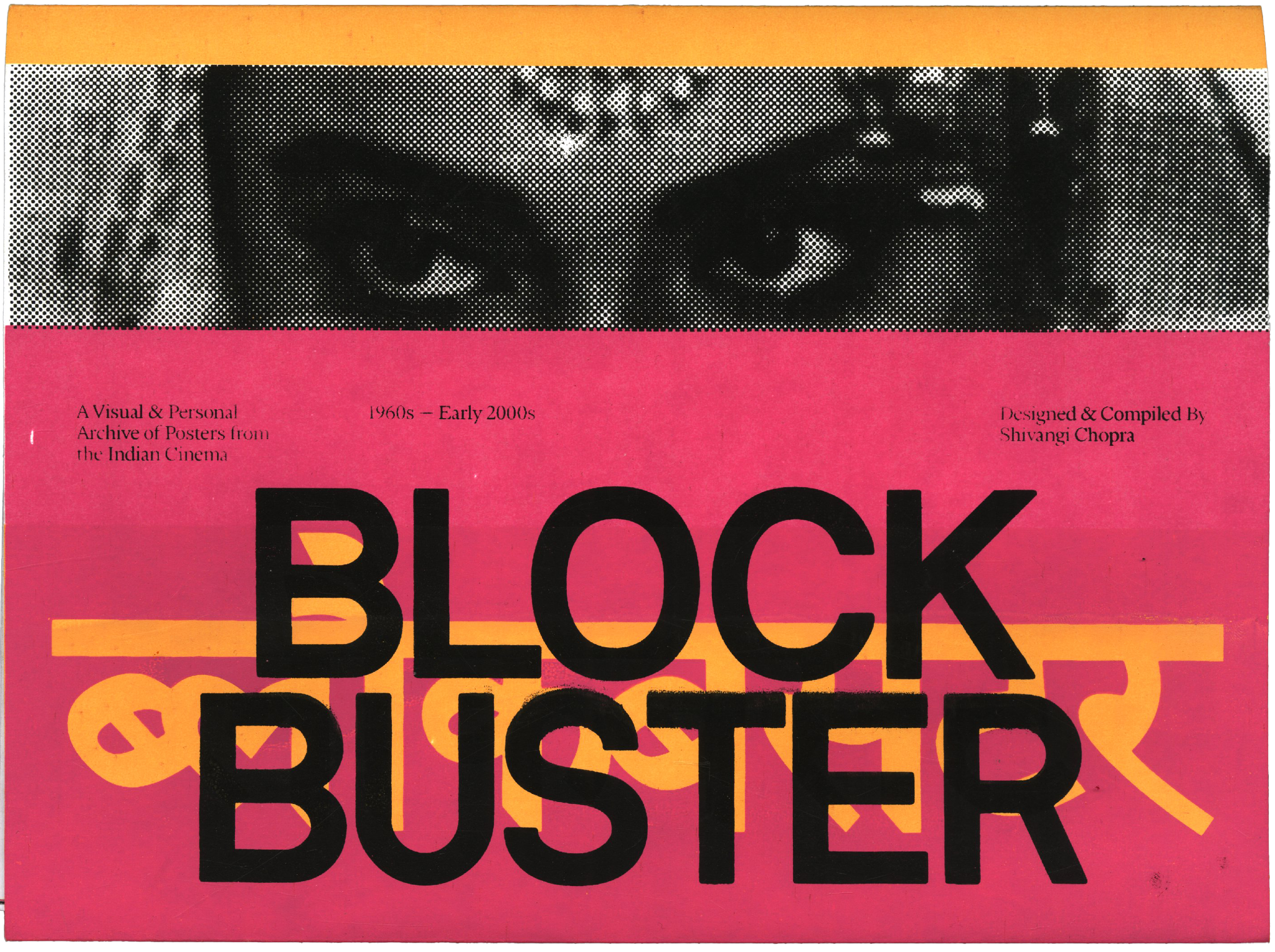
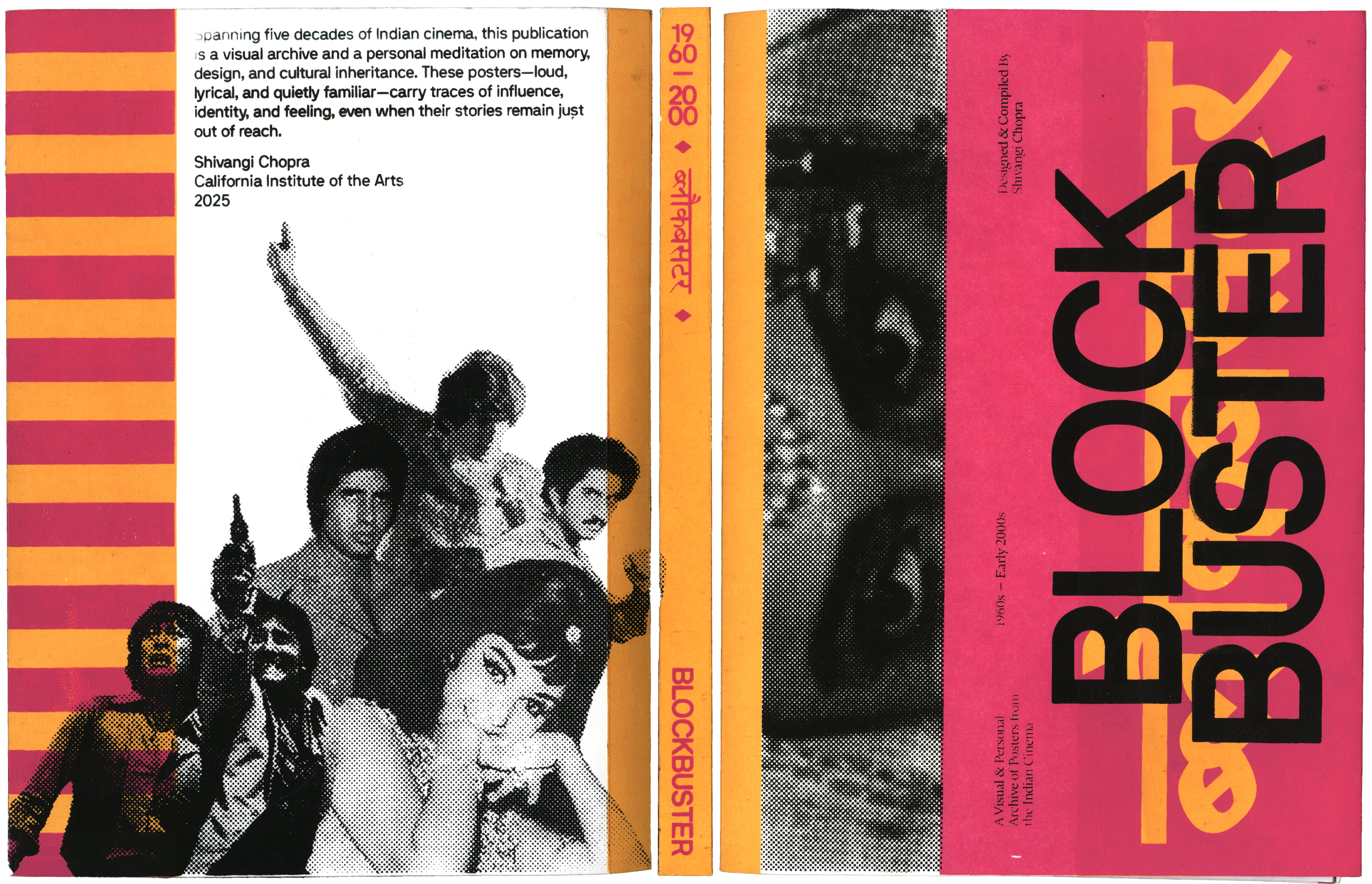
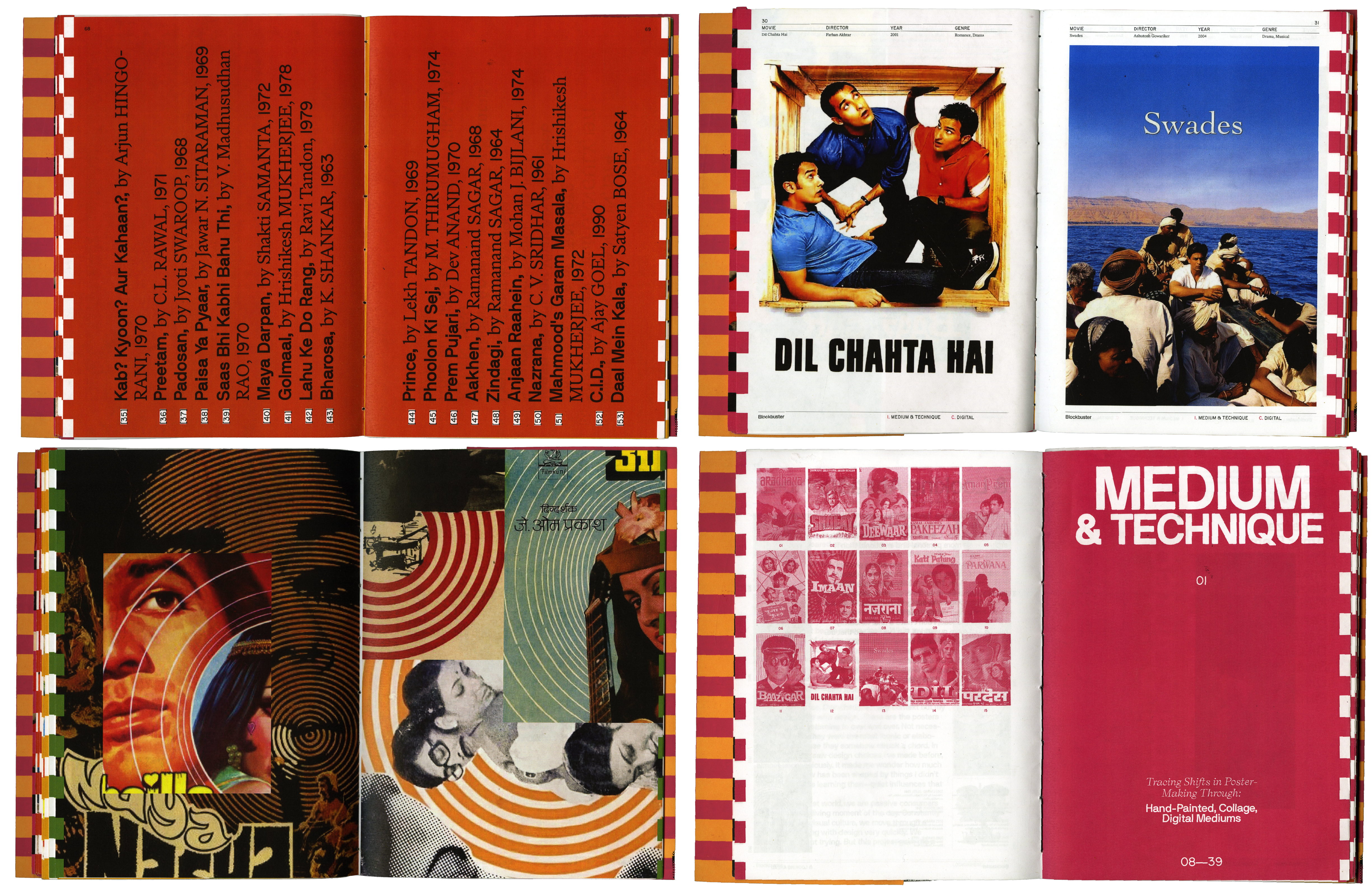
Blockbuster
144-page hand-sewn publication
double-sided screen-printed cover in two colorways
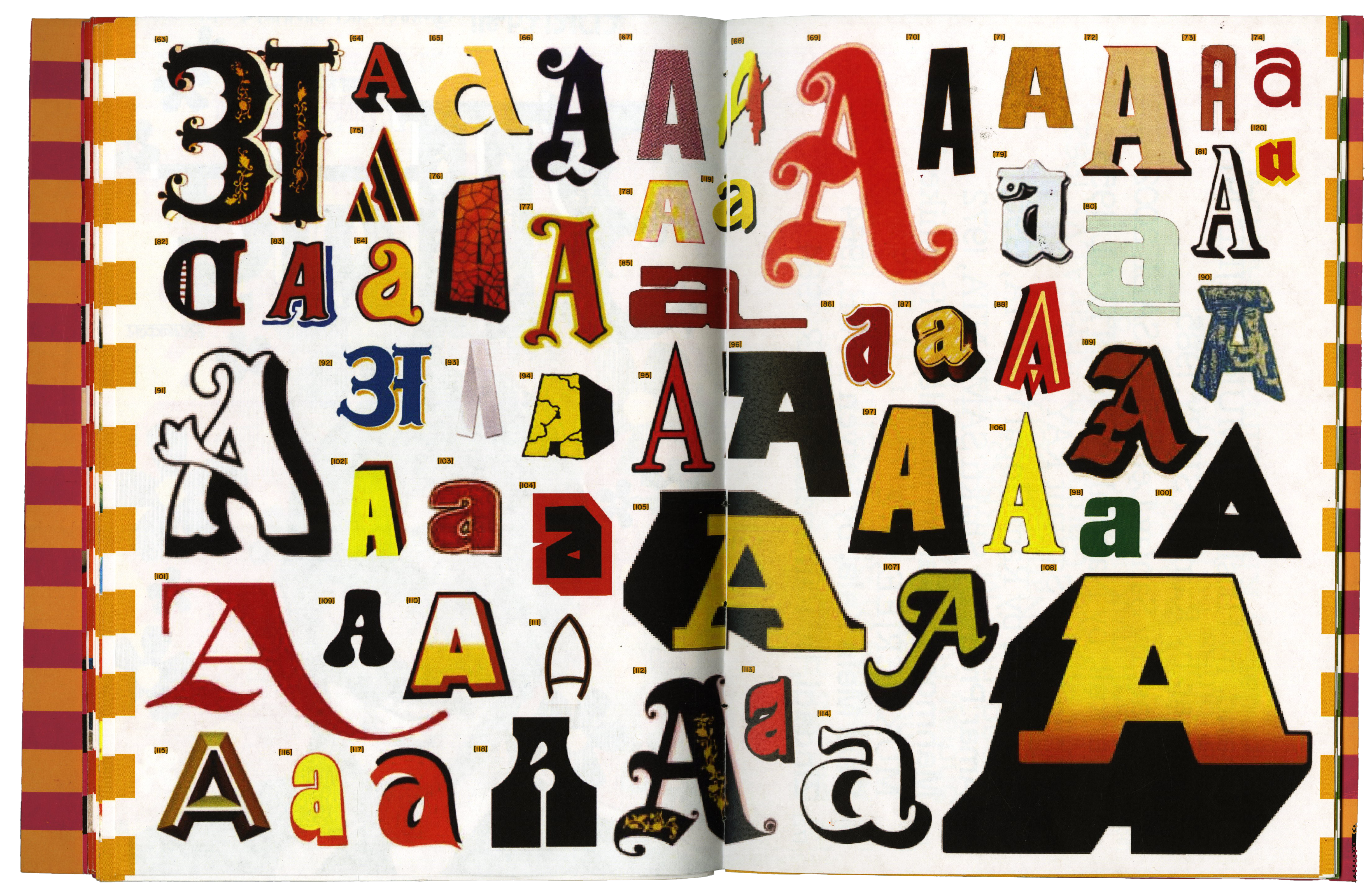
This publication archives typography and graphics from Indian cinema—from the 1960s to the early 2000s. It’s divided into visual motifs rather than a strict timeline, tracing the evolution of design trends across eras and styles. These posters existed in a visual culture that didn’t separate design from art, or art from life.
I looked through over a hundred film posters, eventually curating them into four visual categories: material, color, typography, and composition. The project started with going through over a hundred posters. Some were sourced from online archives, some from personal collections. Many of the early ones were hand-painted, which I found fascinating — growing up, I’d see these images everywhere, but I never thought of them as “design.” They were just part of the environment, part of the visual noise around daily life.
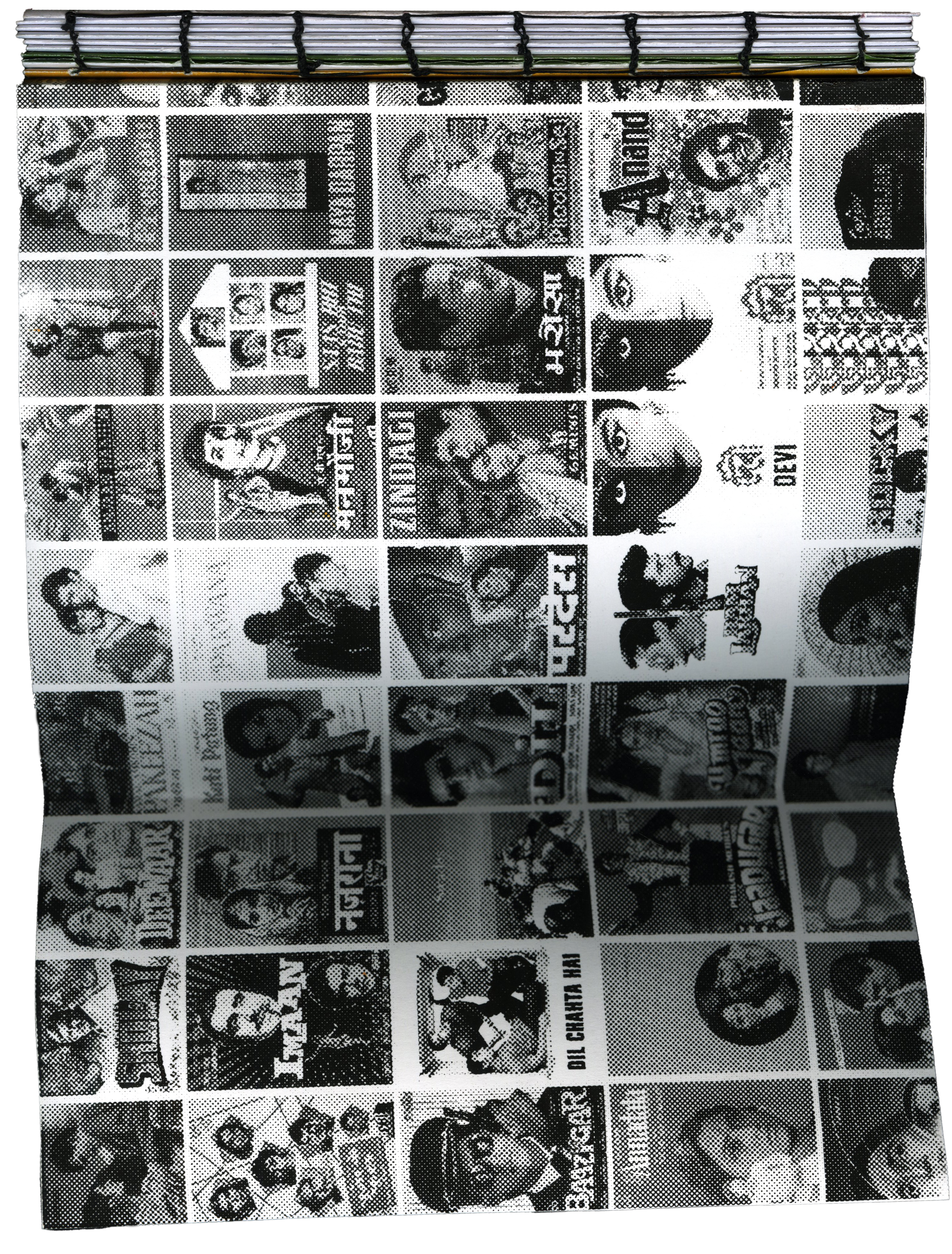
The name Blockbuster felt fitting because these posters were made to grab your attention — loud, bold, and emotional. The word also carries a bit of nostalgia. It points to a specific kind of mass appeal, spectacle, and drama that these films (and their posters) were all about. I liked that it could be both a casual reference and a nod to something larger.
The name Blockbuster felt fitting because these posters were made to grab your attention — loud, bold, and emotional. The word also carries a bit of nostalgia. It points to a specific kind of mass appeal, spectacle, and drama that these films (and their posters) were all about. I liked that it could be both a casual reference and a nod to something larger.
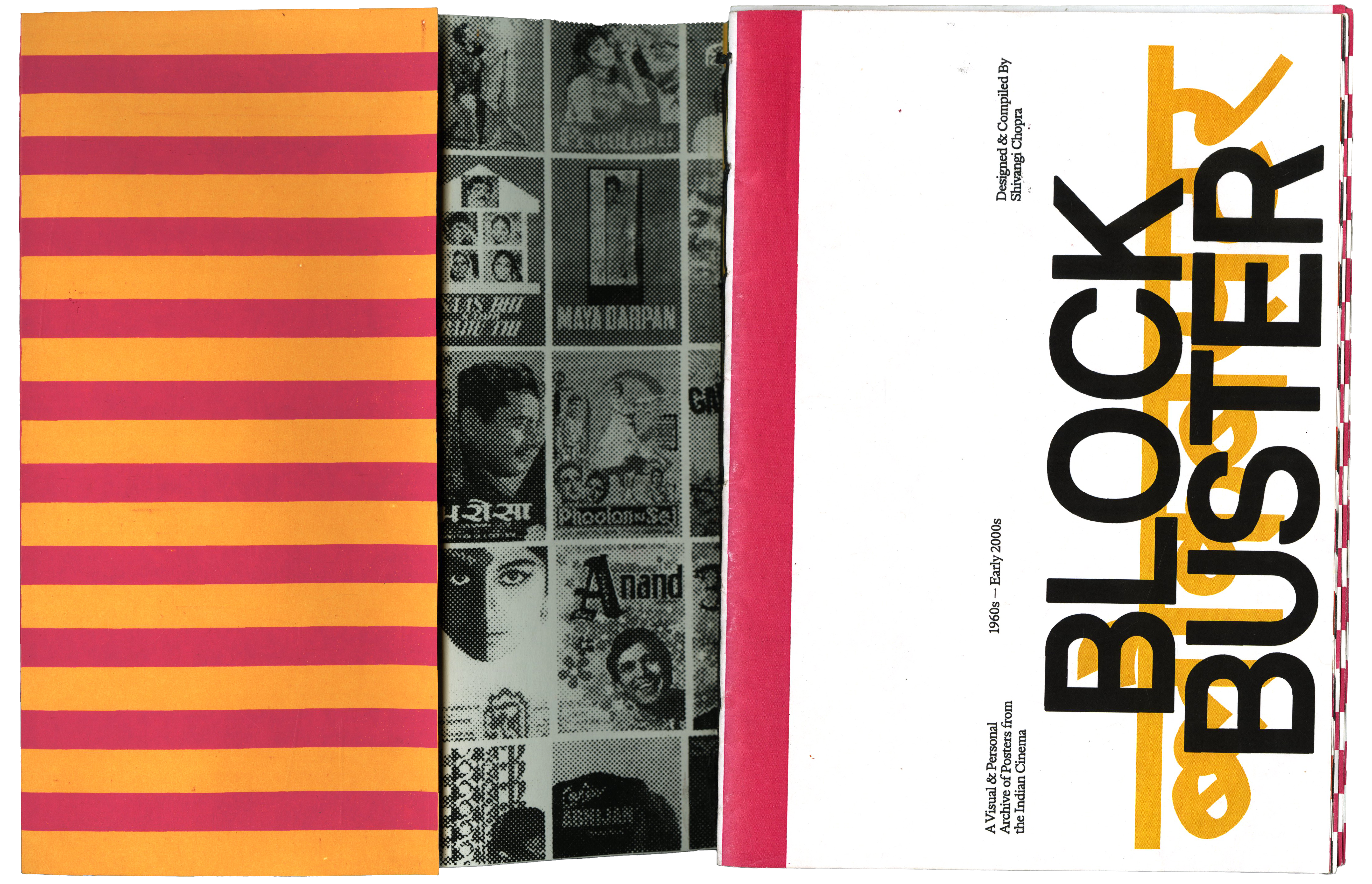
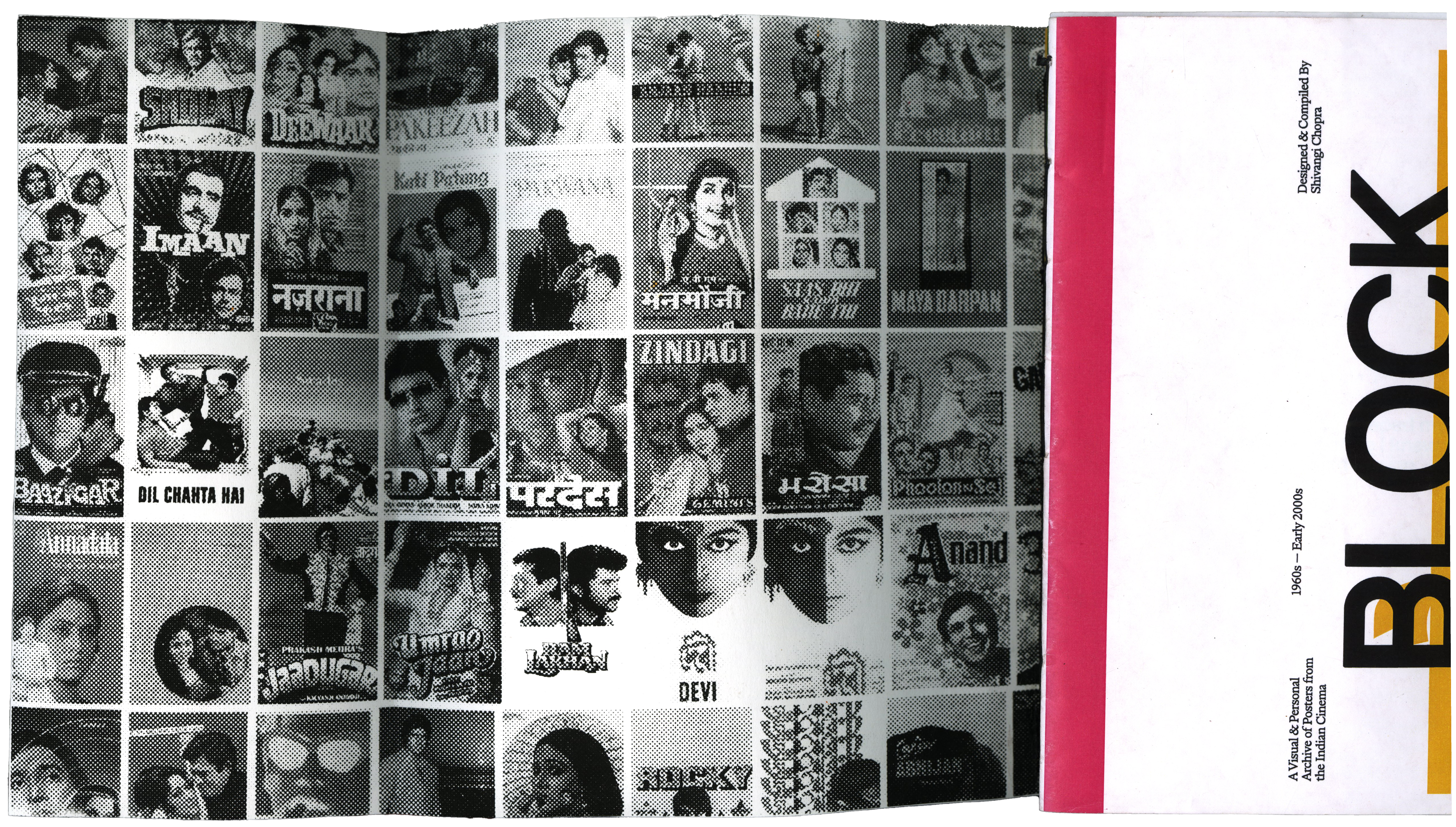
The book has a double-sided, screen-printed cover in two colorways. I wanted the cover to feel tactile and a little rough around the edges — like the textures of old posters you’d see pasted on street corners. I also learned how to coptic bind for this project, which lets the book lie flat and makes the flaps inside easier to open.
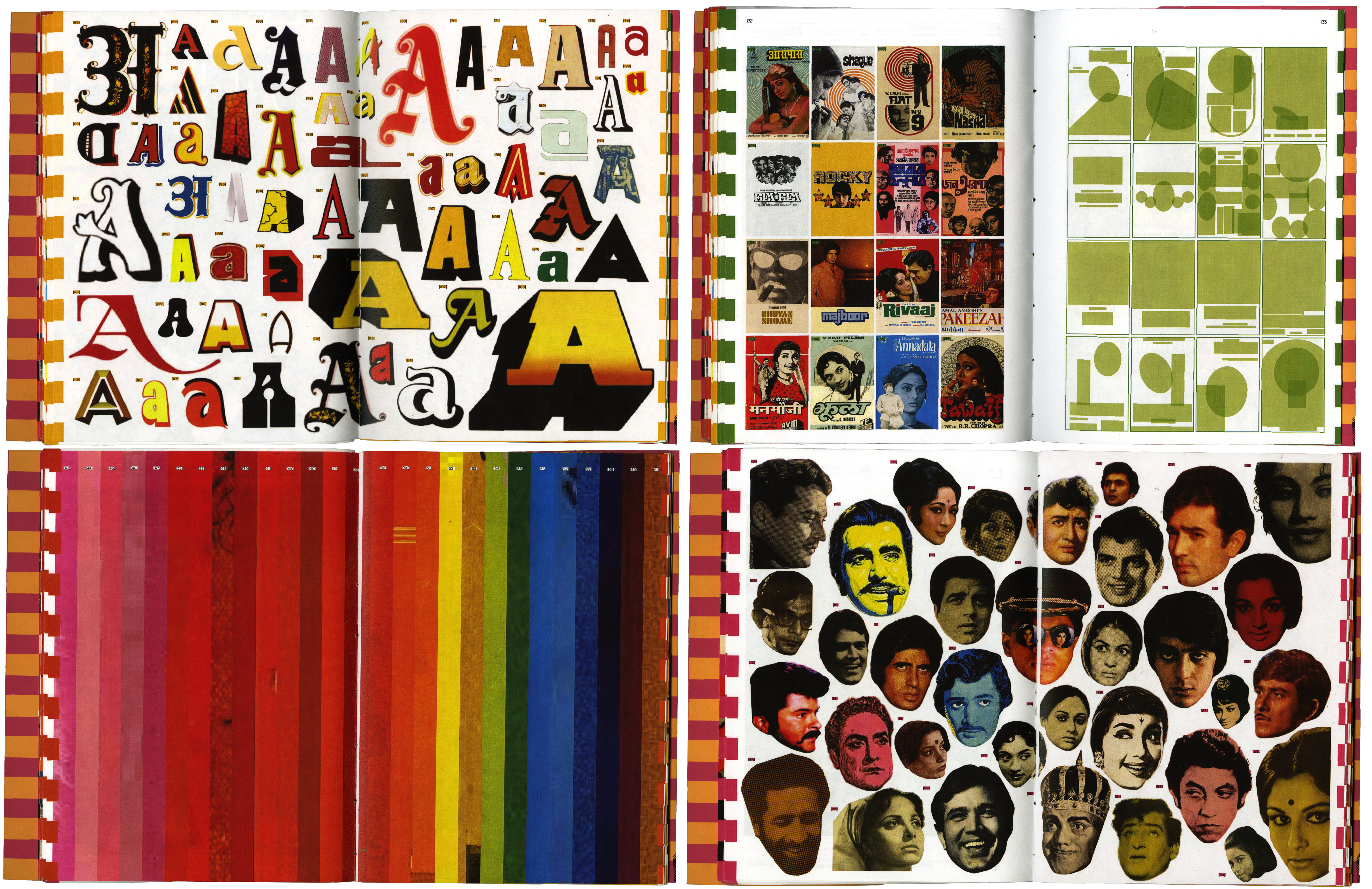
Each section ends with “at a glance” spreads that summarize the visual trends discussed. It’s a way to reflect back on what you’ve just seen and start to notice recurring patterns in a more intentional way.
Awaaz
WIP
Awaaz is a magazine that features a series of interviews with South Asian designers and thinkers, each operating between different cultural, geographical, and aesthetic worlds. The title itself, which means “voice” in Hindi, reflects the core intention of the project: to amplify voices that are often overlooked in the global design conversation.
The magazine is meant to be a dialogue — a space for me to step out of my comfort zone, engage with people who have shaped my understanding of design, and reflect on how South Asian designers navigate the complexities of being underrepresented in the global design community. The project felt important not only because of that underrepresentation but also because it’s a way to connect with others who are also carving out their own paths in a space where their cultural backgrounds don’t always align with the dominant narratives.
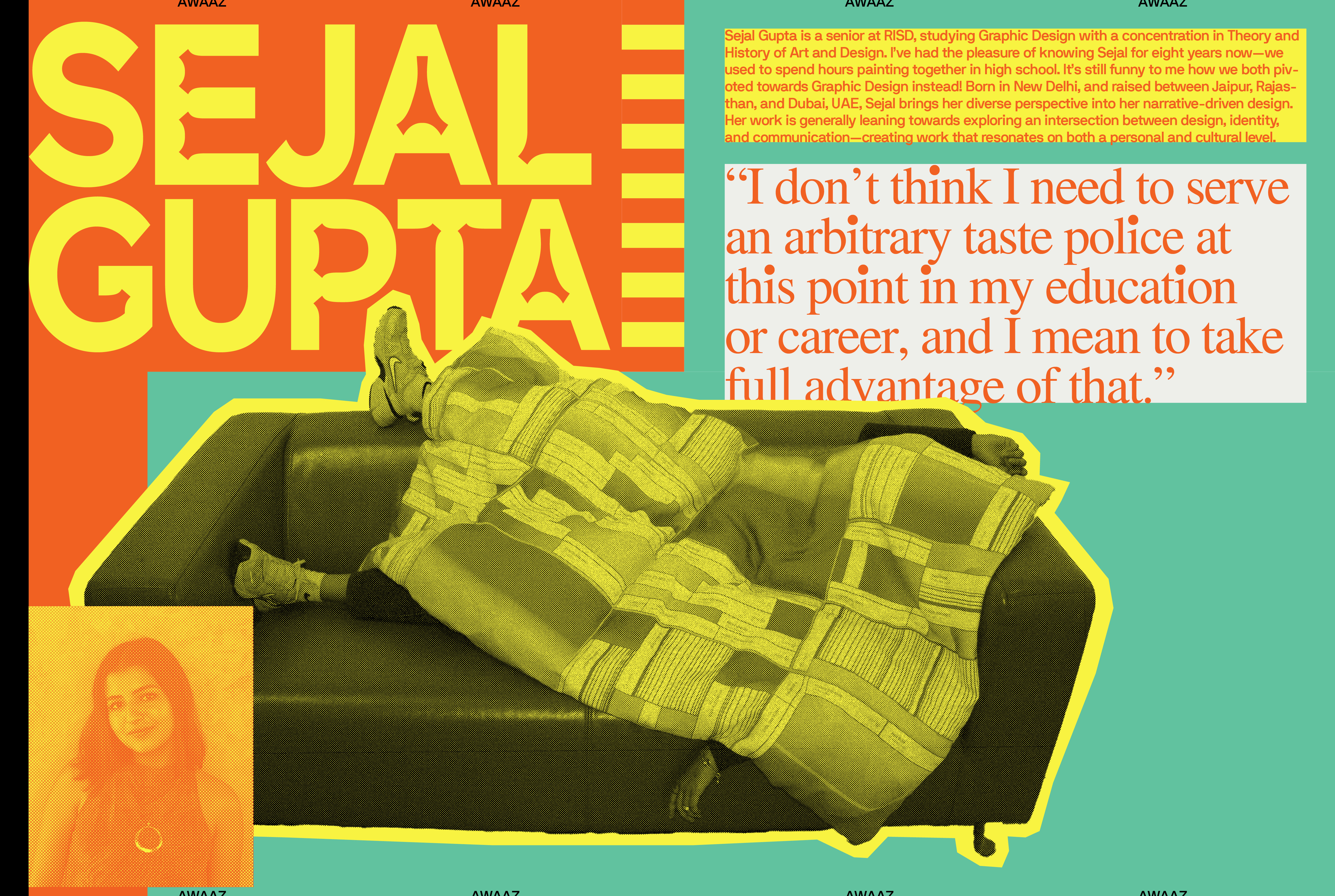
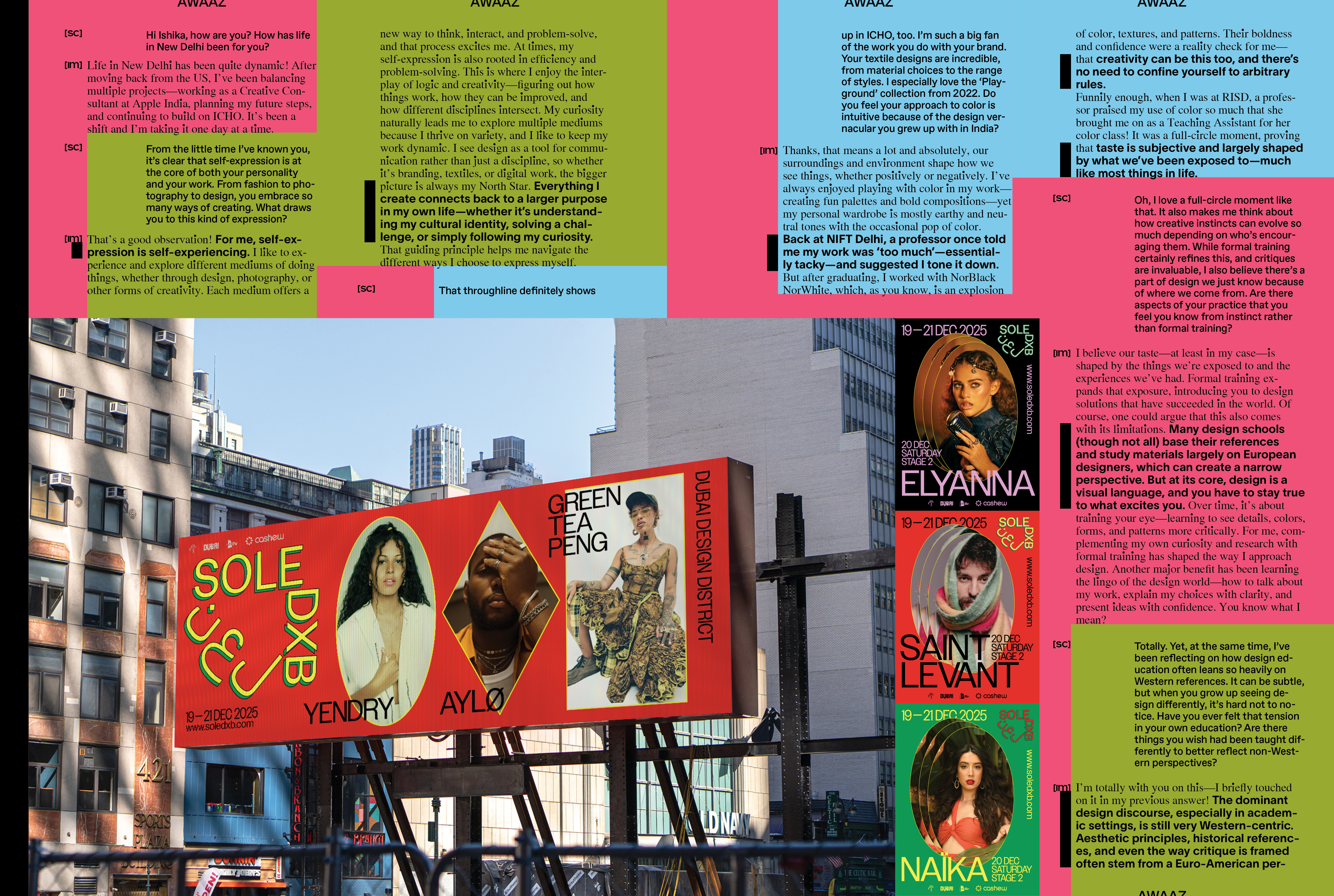
I conducted four interviews: Ananya, who works at Not W+K, a sister studio to Wieden+Kennedy in London. Ishika, a fellow intern from my time at Apple, who now works at Apple in India and runs a clothing brand in Delhi. Shantanu, who works at 72&Sunny in New York and has previously worked at W+K in Portland. Sejal, a high school friend who now studies at RISD — we both started out in fine art and ended up in design, which feels like a nice full circle.
More Is More
Poster Content
Typography isn’t just a vessel for words, but a reflection of language and communication.
Fit is a typeface designed to do exactly what its name suggests: fit into any given space. It embodies the extremes of typographic flexibility—stretching, compressing, and reshaping itself to eliminate empty spaces. Fit Devanagari pushes this objective even further, adapting to the fluid, dense, and expressive nature of the script.
It’s also a fitting metaphor for high-context cultures, where meaning isn’t just in the words themselves but in everything around them. Text, color, imagery, and layout all work together, packed with references that rely on shared cultural understanding—where white space isn’t a necessity—it’s often just another opportunity for meaning. Clarity comes from layering, from relationships, from embedding information within the composition rather than stripping it away. Negative space isn’t the priority—context is.
Fit Devanagari reflects this by quite literally filling the void—its letterforms expand to erase any leftover gaps, ensuring every inch is used with intention. It’s a typeface that embraces density as a design choice, not a flaw.
More isn’t noise. More is communication. More is more.
Grass Between The Stones
Preface
What a city becomes beyond its blueprint is unimaginable—it becomes a living, breathing organism. A city is an accumulation of every word that has ever been uttered—a laugh, an outcry, a proclamation, a death sentence, a prayer—all the unplanned and unexpected that any master plan could have never predicted: all the echoes that shape the history of the city, and a conversation that will continue as long as the city exists.
In 1947, India was torn into two. The partition split Punjab into half, with its former capital, Lahore, lost to Pakistan. It scattered families across the borders, severing histories, and leaving behind a loss that could never be mapped. India needed a new capital for Punjab—one that could symbolize not just administration but hope, stability, and a forward-looking nation.
Chandigarh has no history beneath its streets—it was created as an idea before it was ever a place, a necessity before it was a home.
Le Corbusier, a French architect, was tasked with the responsibility of designing and planning Chandigarh. Despite his initial hesitation, he realized the unique opportunity that was being presented to him—an opportunity where he could implement the utopian ideas on urbanism that he had been developing since the early twenties. He imagined it as a city of logic and clarity. A place of order amidst the chaos of rapid post-independence urbanization. The grid was strict, the roads wide, the sectors self-contained—each one designed to balance function and leisure, public and private life. A living, breathing body—its head in Sector 1, where the Capitol Complex, High Court, and Secretariat would reside; its heart in Sector 17, the hub of social and commercial activity; and its lungs in the open green forest reserves.
But as a matter of fact, architectural blueprints, like any design plan, do not account for the grass between the stones. People, in blueprints, are faceless figures placed to indicate the scale of structures, walking from point A to point B in a straight line that fits into the design. Yet no matter how rigid a grid may be, it is bound to soften its edges over time.
Chandigarh now exists perfectly in the inbetweens—as the capital of not one, but two states, Punjab and Haryana; as a Union Territory that is controlled directly by the central government rather than the state. It exists between the rational and the instinctive, between an imagined utopia and the reality of normalcy. It is a modernist city that still somehow is warm and familiar. The logic of Corbusier’s grid coexists with the improvisational rhythm of the people who live in it. There is a space between what is designed and what is experienced—yet rather than a conflict, it has become a peculiar harmony, a quiet understanding between the two.
Grass Between The Stones
Give Me Back My Damn Chair
The modernist ideals of Chandigarh were meant to define not just the city and its structures, but its lives. Yet over time, these ideals have taken new meanings—sometimes stripped of their original context.
The Chandigarh Chair, designed by Pierre Jeanneret, was a functional, accessible, mass-produced object. It was designed to be a staple for government offices and public institutions, but it is now auctioned for thousands of dollars abroad—rebranded into a luxury object, coveted by collectors across Europe and North America.
The chairs were separated both physically and in terms of time from their original home in Chandigarh. The value of Chandigarh’s chairs and its furniture became disconnected from its roots and its use, and became tied instead to Jeanneret, the West, and the chair's ability to look pretty in fancy interiors. The New York Times ran a headline calling Chandigarh “A City That Sat On Its Treasures, but Didn’t See Them.” And reportedly, Kourtney Kardashian owns twelve.
But they weren’t “treasures” when they were created. They became valuable only when removed from their context—when detached from the people who actually used them, and reattached instead to Jeanneret’s name, Western design history, and the aesthetic tastes of the elite. In reality, the design of these chairs was not Jeanneret’s alone. Indian architect and designer Eulie Chowdhury played a role in developing the furniture for Chandigarh’s homes and public buildings, yet her name is rarely mentioned in the chair’s retelling. Her contributions—like so many others—were quietly omitted from the story as it was repackaged for Western consumption.
This transformation didn’t happen by accident. It was constructed—by institutions, auction houses, and magazines—who claimed the chairs had been forgotten and neglected in Chandigarh, even though they remained in active use across the city for decades. What this narrative omits is the fact that this furniture was in constant use in Chandigarh’s administrative buildings and universities for over forty years—and, in many places, still is.
Somewhere along the way, the chair became more than furniture—it became a symbol of extractive capitalism. A case study in how cultural identity is romanticized, repackaged, and resold—how something functional can so easily become fetishized. Its value didn’t come from the hands that used it daily, but from the hands that later claimed it, when it stopped being seen as Indian and began being claimed as European.
There’s a certain heartbreak in watching something so ordinary be separated from its home, its people, and then returned only as a myth. The way memory can become aesthetic. The way longing can become a commodity. And the way a city and its history can be misunderstood when only seen through the filter of nostalgia or foreign desire.
Blockbuster
Looking Back & Looking Ahead
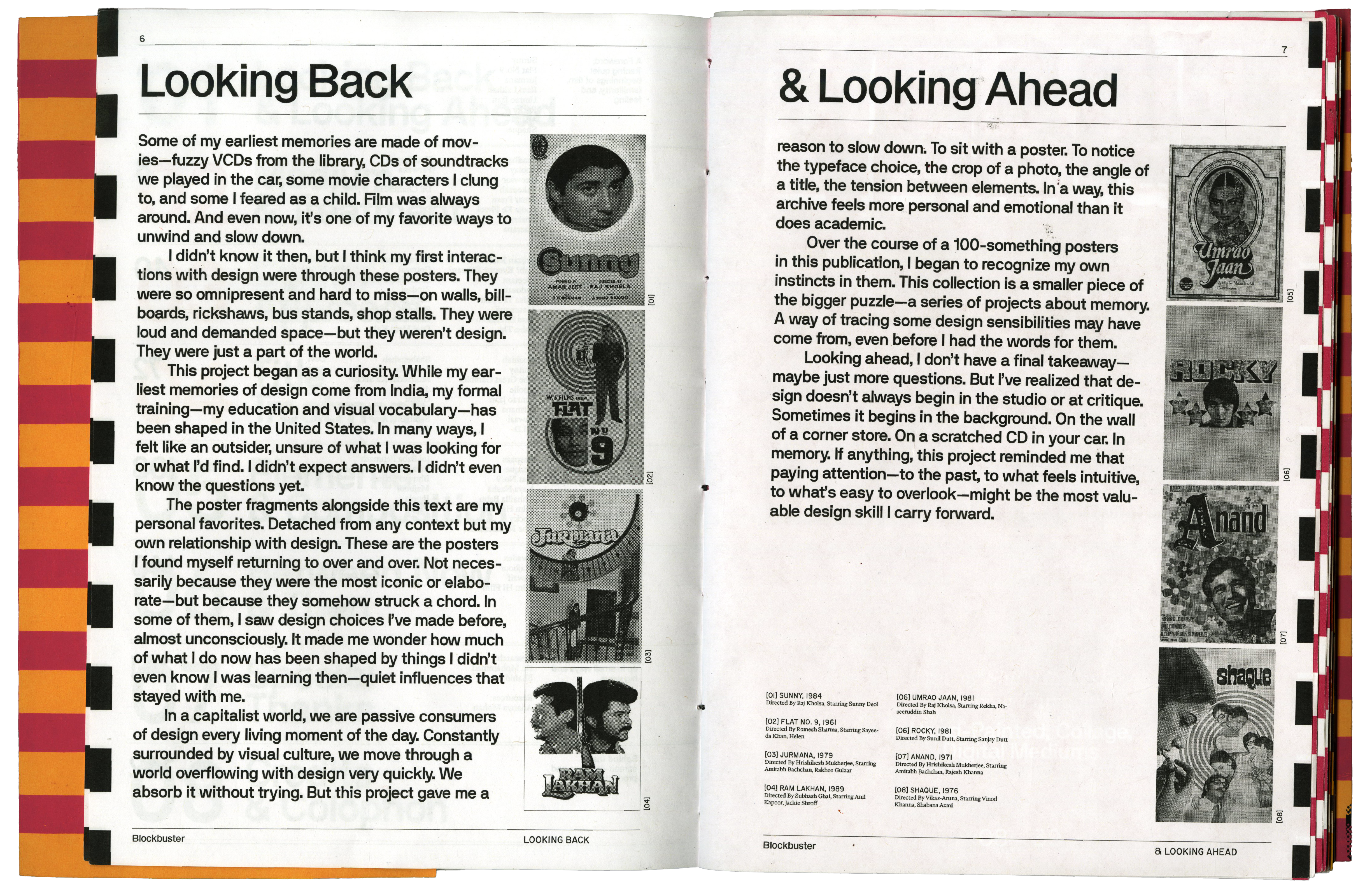
Some of my earliest memories are made of movies—fuzzy VCDs from the library, CDs of soundtracks we played in the car, movie characters I clung to, and movie characters I feared as a child. Film was always around. And even now, it’s one of my favorite ways to unwind and slow down.
I didn’t know it then, but I think my first interactions with design were through these posters. They were so omnipresent and hard to miss—on walls, billboards, rickshaws, bus stands, shop stalls. They were loud and demanded space—but they weren’t design. They were just a part of the world.
This project began as a curiosity. While my earliest memories of design come from India, my formal training—my education and visual vocabulary—has been shaped in the United States. In many ways, I felt like an outsider, unsure of what I was looking for or what I’d find. I didn’t expect answers. I didn’t even know the questions yet.
The poster fragments alongside this text are my personal favorites. Detached from any context but my own relationship with design. These are the posters I found myself returning to over and over. Not necessarily because they were the most iconic or elaborate—but because they somehow struck a chord. In some of them, I saw design choices I’ve made before, almost unconsciously. It made me wonder how much of what I do now has been shaped by things I didn’t even know I was learning then—quiet influences that stayed with me.
In a capitalist world, we are passive consumers of design every living moment of the day. Constantly surrounded by visual culture, we move through a world overflowing with design very quickly. We absorb it without trying. But this project gave me a reason to slow down. To sit with a poster. To notice the typeface choice, the crop of a photo, the angle of a title, the tension between elements.
In a way, this archive feels more personal and emotional than it does academic. Over the course of a 100-something posters in this publication, I began to recognize my own instincts in them. This collection is a smaller piece of the bigger puzzle—a series of projects about memory. A way of tracing some design sensibilities may have come from, even before I had the words for them.
Looking ahead, I don’t have a final takeaway—maybe just more questions. But I’ve realized that design doesn’t always begin in the studio or at critique. Sometimes it begins in the background. On the wall of a corner store. On a scratched CD in your car. In memory. If anything, this project reminded me that paying attention—to the past, to what feels intuitive, to what’s easy to overlook—might be the most valuable design skill I carry forward.
Blockbuster
Between Now & Then
Looking back, I came into this project expecting a clear divide between minimalism and maximalism, the West and the East. What I found, though, was more nuanced. The posters I encountered were loud, vibrant, and demanding—but beneath their surface, there was an undeniable quietness, a sense of connection that went beyond design.
Most of the movies in this publication, I’ve never actually seen. But I know their music, and I know how they feel. I know how my dad felt growing up with those songs, and how his dad must have felt too. There’s a certain timelessness to these pieces—one that’s carried not just through sound, but through design. There is a certain timelessness to these pieces that is carried through design. In the absence of full knowledge, there was something deeply personal and familiar, even when the full story remains just beyond reach.
Blockbuster
Special Thanks
I came across a series of research papers by Dr. Mohammad Shahid, an Assistant Professor at the Department of Design, IIT Hyderabad. Dr. Shahid’s work on cultural heritage, experimental typography, and visual culture, particularly his research on Bollywood movie posters and their visual rhetoric, was invaluable to me. At first, I was hesitant to pursue a publication on this topic, believing it was too under-researched and overlooked, especially in India, where design isn’t always recognized for its cultural impact. Dr. Shahid’s extensive research not only shaped the body of this publication but also pushed me to keep going when I felt stuck.
I also want to thank Ananya Mohan for her extensive Are.na board and the beautiful collection of film posters that served as both a resource and inspiration.
Lastly, I want to extend my gratitude to a handful of people who supported me through this publication, both in big ways and small. Some may not even know the full extent of their impact, but their encouragement, advice, and presence made this journey possible.
Michael Worthington
For endless critique, reality checks, and wisdom.
Gail Swanlund
For faith, thoughtful references, and interest.
Armando Martinez-Celis
For time, patience, belief, and laughs.
Brooke Irish
For wisdom, knowledge, and comfort.
Ally Sutton
For listening, understanding, and knowing without words.
Freeze Shi
For time, references, and foresight.
Maya Alvarado
For encouragement, critique, and shenanigans.
Kari Trail
For inspiring, listening, and being present.
Sophia Sher
For listening, paying attention, and support.
Anushka Shah
For inspiring without knowing.
Mom
For endless encouragement, unwavering faith, and quiet creative ways.
Dad
For sharing, not always understanding, but listening anyways.
Sejal Gupta
Awaaz
[SC] Hi, Sejal! I hope your last semester at RISD is treating you well. How do you feel?
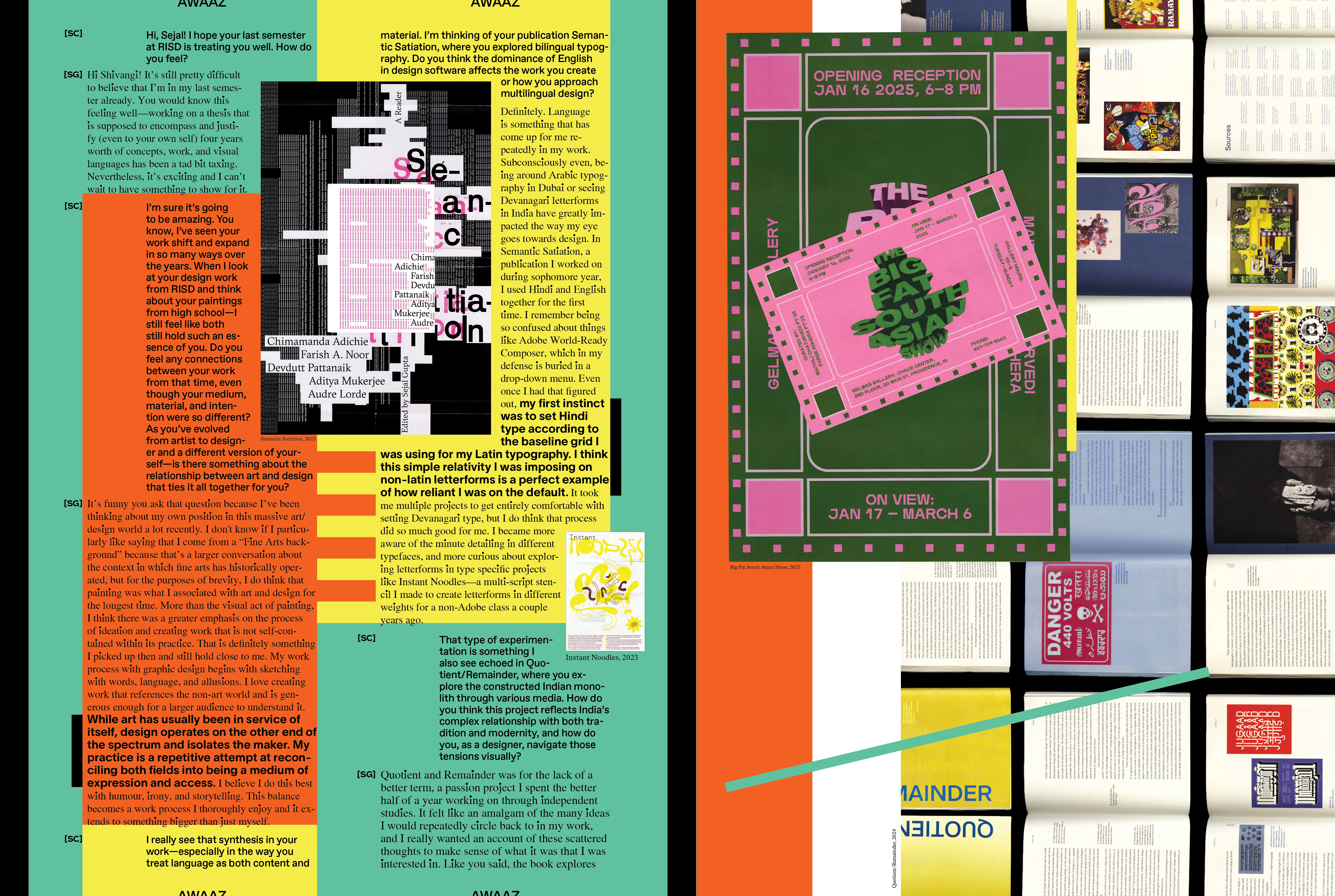
[SG] Hi Shivangi! It’s still pretty difficult to believe that I’m in my last semester already. You would know this feeling well—working on a thesis that is supposed to encompass and justify (even to your own self) four years worth of concepts, work, and visual languages has been a tad bit taxing. Nevertheless, it’s exciting and I can’t wait to have something to show for it.
[SC] I’m sure it’s going to be amazing. You know, I’ve seen your work shift and expand in so many ways over the years. When I look at your design work from RISD and think about your paintings from high school—I still feel like both still hold such an essence of you. Do you feel any connections between your work from that time, even though your medium, material, and intention were so different? As you’ve evolved from artist to designer and a different version of yourself—is there something about the relationship between art and design that ties it all together for you?
[SG] It’s funny you ask that question because I’ve been thinking about my own position in this massive art/design World a lot recently. I don't know if I particularly like saying that I come from a “Fine Arts background” because that’s a larger conversation about the context in which fine arts has historically operated, but for the purposes of brevity, I do think that painting was what I associated with art and design for the longest time. More than the visual act of painting, I think there was a greater emphasis on the process of ideation and creating work that is not self-contained within its practice. That is definitely something I picked up then and still hold close to me. My work process with graphic design begins with sketching with words, language, and allusions. I love creating work that references the non-art world and is generous enough for a larger audience to understand it.
While art has usually been in service of itself, design operates on the other end of the spectrum and isolates the maker. My practice is a repetitive attempt at reconciling both fields into being a medium of expression and access. I believe I do this best with humour, irony, and storytelling. This balance becomes a work process I thoroughly enjoy and it extends to something bigger than just myself.
[SC] I really see that synthesis in your work—especially in the way you treat language as both content and material. I’m thinking of your publication Semantic Satiation, where you explored bilingual typography. Do you think the dominance of English in design software affects the work you create or how you approach multilingual design?
[SG] Definitely. Language is something that has come up for me repeatedly in my work. Subconsciously even, being around Arabic typography in Dubai or seeing Devanagari letterforms in India have greatly impacted the way my eye goes towards design. In Semantic Satiation, a publication I worked on during sophomore year, I used Hindi and English together for the first time. I remember being so confused about things like Adobe World-Ready Composer, which in my defense is buried in a drop-down menu. Even once I had that figured out, my first instinct was to set the Hindi type according to the baseline grid I was using for my Latin typography. I think this simple relativity I was imposing on non-latin letterforms is a perfect example of how reliant I was on the default.
It took me multiple projects to get entirely comfortable with setting Devanagari type, but I do think that process did so much good for me. I became more aware of the minute detailing in different typefaces, and more curious about exploring letterforms in type specific projects like Instant Noodles—a multi-script stencil I made to create letterforms in different weights for a non-Adobe class a couple years ago.
[SC] That type of experimentation is something I also see echoed in Quotient/Remainder, where you explore the constructed Indian monolith through various media. Can you walk me through this project? How do you think this project reflects India’s complex relationship with both tradition and modernity, and how do you navigate those tensions visually?
[SG] Quotient and Remainder was for the lack of a better term, a passion project I spent the better half of a year working on through independent studies. It felt like an amalgam of the many ideas I would repeatedly circle back to in my work, and I really wanted an account of these scattered thoughts to make sense of what it was that I was interested in. Like you said, the book explores the formulated idea of “Indianness” that is attributed (wrongfully) to the whole of South-Asia through design, language, culinary practices, visual, and popular culture. I was trying to articulate the symbiotic relationship between the maker, and the content we consume. So much of the media about South Asia disregards the plurality of visual, semiotic, and culinary traditions present within the sub-continent. The way in India is represented in media in particular greatly impacts the way the Western gaze, which is considered synonymous to the objective gaze. All media about India aims to date the entirety of the country to a time hundreds of years ago. The kind of typography, and images being curated about India is still a legacy of colonial influence.
Within South-Asia, there are a multitude of traditions that differ from cities to states. Despite this, the same ignorant sepia filter is glazed over all media about South-Asia to self-reference and justify all the content that has come before it. I also think this impacts a lot of the projects being developed within India too. They are being made to serve the Western Gaze which has been increasingly adopted by the diaspora, and people living in India. For me, within design, I refuse to make work that is palatable to the biased gaze. I try to use colours, typefaces, and material, among other things that don’t reinforce this fetishised idea of my cultural traditions.
And while these gestures seem really elementary by themselves, all these elements come together to prop themselves up and embellish the system. There is an expectation from Indian designers to create work that looks “Indian”—whatever that means, and I think whatever we can do to counter that assumption while also staying true to the design that has actually influenced us is a step towards making a mark.
[SC] You’ve mentioned growing up in India and the UAE. I’ve always been fascinated by how visual communication often reflects our immediate physical, cultural, and political surroundings. This is why some design decisions can feel more intuitive than learned. Do you think these influences shape how you approach composition and structure in your work?
[SG] Yeah, I think maybe more subliminally than anything else. There’s currently this overwhelming tendency towards minimalism in the design environment I find myself in at RISD (but also everywhere else), and I have so many times felt so alienated by it. I think even if I really wanted to, I wouldn’t be able to do it. I naturally lean towards creating work that feels visually complex and dense. I think intuition is a great word for it.
Even the kind of influences and design sensibilities I look for are so visually playful and experimentative and that inherently translates into my projects. I’m not ignorant of how quick one can be to attach the word kitsch to such work, but I don’t think I need to serve an arbitrary taste police at this point in my education or career, and I mean to take full advantage of that.
[SC] Yes! That really hits home. I feel like identity is such a huge part of design, which is why it often feels inseparable from art to me. Even when designing for someone else, a part of you inevitably makes its way into the work. As a South Asian designer, your work might immediately be seen through that lens, whether or not that was your intention. How do you navigate through the underrepresentation of South Asian designers, and have you ever felt your work was categorized in a way that didn’t align with your vision?
[SG] I hope I’m not repeating myself, but I often feel the weight of making work that is overtly Indian, no matter how separate it might be from the themes I’m working on. We’re unfortunately stuck between a hard place and a rock, where our work is always considered either “too Indian” or “not Indian enough.” Because I’m designing in the USA, around an audience that is wired to prescribe identity associations to my work, there have been so many instances where I have found myself critiquing my own work through this lens.
I think at the end of the day, I have to remind myself that Indianness is an arbitrary notion ascribed to work that might not even be remotely related to India. What it means to be a South-Asian designer is a reflection of South-Asian geographies. It’s no shock that we are so segregated by multiple factors, and our differences are what begin to somewhat define us. I can be as informed by B.V Doshi as I am by El Lissitsky, and still be secure in my “Indianness.” There is no one objective way to be a South-Asian designer and I’m gradually learning and relearning that with everything I make.
[SC] That makes me think about something I read that really stuck with me: “The process of unseeing Western culture is like getting a fish to understand that it’s in water.” When a homogenous group decides what’s “good,” it shapes the profession in a way that pushes most designers toward a singular aesthetic. Do you think your design interactions in Dubai and Jaipur conflicted with your education at RISD?
[SG] Not just at RISD, but most designs I interact with on a daily basis are created to be appealing for the specific euro-centric taste bud. This is funny, but just today, I was at a grocery store and saw a packet of namkeen, called “Doosra”—an alternative snack to potato chips maybe. The language we use to talk about non-western design traditions already other them, and design further reinforces this notion. If we were to go by Dieter Rams’ definition of Good Design, anything that is not functionally productive is unsuccessful. This is probably one of the reasons why I’m still navigating my position as a designer. I like to think I operate somewhere in the middle of the Art and Design World and the work I make conforms to neither field entirely. I’ve found, particularly in Dubai, design is specifically made with its audience in mind.
I naturally see Arabic typography a lot more, but even the design for something as ubiquitous as Dubai’s visual identity created by Samar Maakaroun is informed by Arabic letterforms. It is “decorative,” warm, accessible, and perhaps the antithesis of the Western design cannon. Yet, it works, and beautifully so. I think this a long way around saying that designing and consuming design in the West reinforces morphed and self-servicing ideas of good design, but being in a position to access non-western sensibilities is a good reminder of the multitude of design traditions that have flourished and continue to, without needing the embrace of the Western audience.
Shantanu Sharma
Awaaz
[SC] Hi Shantanu, thank you so much for participating in this interview. How are you doing?
[SS] Thanks for having me! I’m doing great.

[SC] To start off, I’d love to talk about your background—because your path and the places you’ve lived clearly inform your perspective. Design feels like a reflection of our surroundings—subjective, fluid, and deeply tied to language and communication. Just as languages and cultures evolve across regions, design can shift based on place and context. Has your relationship with design evolved as you’ve moved through different environments?
[SS] That’s a great way of putting it–I couldn’t agree more. I’ve moved around quite a bit. I was born in Sri Lanka, grew up in Singapore and Dubai and finished high school in New Delhi before taking the leap to go to New York for art school. I do feel like I've adopted a lot of my sensibility from each place–the environments I grew up in in India were bold and loud with bright colours and in Singapore and Dubai environments felt a bit ‘perfect’ and man-made. I’d like to think there’s a lot of order in chaos in my work and practice, especially in how I approach each project and that’s probably a subconscious influence from those environments.
I do feel the constant change and need to adapt while moving has also influenced my work quite a bit– I find it hard to continue repeating one particular style or way of working and often yearn for change in the variety/kinds of projects I take and get to work on. All that to say I do find a bit of comfort in some discomfort, part of the reason why I wanted to move to NY and love living here.
My relationship with design definitely has evolved in different environments, I only truly understood/got the grasp of what design is when I was in art school, a lot of those realizations have come through and continue to come with experience and reflection. I naturally gravitate towards bright colors, symmetry, busy compositions, and expressive typography– a lot of which is a direct influence from Indian culture, art, and architecture.
[SC] There’s such a richness in how all those places show up in your work—especially that sense of “order in chaos.” I think that’s part of what drew me to some of your older illustration work, too. Your zine Medley especially stood out—it was so funny and specific. What usually pulls you toward a subject for your personal projects?
[SS] Thanks! I was really obsessed with sci-fi movies and comic books growing up, typical “boy” interests, I know. When I was 11, we had just moved to Delhi from Dubai and it was initially pretty difficult for me to settle in and accept the change. I didn't really want to go to school so I faked a back injury to pretend to be bedridden for a couple of months, much to my family’s concern. I actually was hurt for a short period of time but prolonged the act for as long as I could. I would be home alone and to kill time by drawing a lot– a lot of skeletons, and skulls, copying comic book poses, old punk rock posters, etc. It’s funny to look back at that time now because that’s when I feel I got pretty good at illustration. I learned how to draw figures, understood proportions, and developed different techniques through imitation.
After filling up a few sketchbooks mimicking other people’s work I decided to create characters of my own that eventually amounted to self-portraits and drawing myself using comic book poses as references. That developed into more ‘personal’ personal work. I would draw myself in different situations and became a way for me to express myself. I initially got into/was applying to art schools as an illustration and animation major but my mum told me I would make more money studying design, so that was an easy pivot.
It took me up until the second half of my junior year to call myself a ‘graphic designer’. I was relying on illustration quite a bit up until then. I started to treat letterforms as shapes and that really shifted my perspective because I realized I could continue to apply my illustration sensibilities in the context of typography and that would by default make me a graphic designer. My personal work always stems from how I’m feeling, what I’m gravitating towards, an itch I want to scratch, or something I wish I was better at–I still consider everything I make for myself a self-portrait, even if I’m not slapping my face on it anymore.
[SC] That transition from illustration to design is fascinating, especially the way you describe learning by imitation. It reminds me of how some aspects of design—taste, gut instinct, a sense of balance—feel almost intuitive. Do you feel like there are parts of design that just “click” for you, beyond what can be taught?
[SS] Of course! I would say it mostly depends on your subconscious influences (interests, hobbies, upbringing, etc.) that inform one’s taste. I believe taste can’t be taught, it’s developed based on how much one exposes themselves to ‘good work’ and what one derives from it for them to decide its value. In my experience, a lot of my taste was derived from imitation, and ‘stealing like an artist’. I spent a lot of time mimicking other people’s work when I was starting off but tried to take a step back and understand why they were making certain decisions and apply my own meaning to it in my work. That really helped me practice and also put myself in the shoes of people who I admired to try and understand how their taste informed their design decisions.
[SC] And I think a lot of that intuition is also shaped by the visual language we grow up around—what we’re taught to see as “good” or “refined.” I’ve been thinking about how dominant Western design standards still are, even globally. Have you felt that in your own education? How do you think your perspective might’ve shifted if you had studied in South Asia instead?
In a way, yes. I think it’s only natural to be heavily influenced by Western conventions and taste– it’s archived and documented better so there are more frames of reference to look up to from the past, and it’s also heavily romanticized in the East. I was fortunate to receive my formal design education in New York– an incredibly diverse city with creatives from all over the world so I always felt I was exposed to new ways of thinking to the point of overstimulation because I made a conscious effort to surround myself with it.
I think I would’ve romanticized Western conventions in design a lot more if I received my formal education back home because I wouldn’t have had the lived experience here of having that bubble burst. I think I’m making a conscious effort to derive more inspiration from my upbringing and South Asia in an effort to differentiate myself here more. Everyone has a unique point of view, just depends on how you spin it to make it compelling.
That tension between cultural inheritance and globalized design is something a lot of us are working through. And even when working with big brands like Nike, I wonder—do you find ways to bring parts of your identity into those projects, even when you’re adapting to client needs or working with large teams?
[SS] For sure, my sensibilities are mine and it always finds a way to creep into whatever I work on. It honestly depends on how big the team is and how much influence I have over a project to be able to allow for my own taste to inform the process and the final product. I do take myself out of the equation and work in the best interest of the client and brief but it’s only natural to have reflections of who you are and what you gravitate towards inform the work. It also depends on how I’m able to pitch and sell directions to convince teams and clients that it makes the most sense given the context.
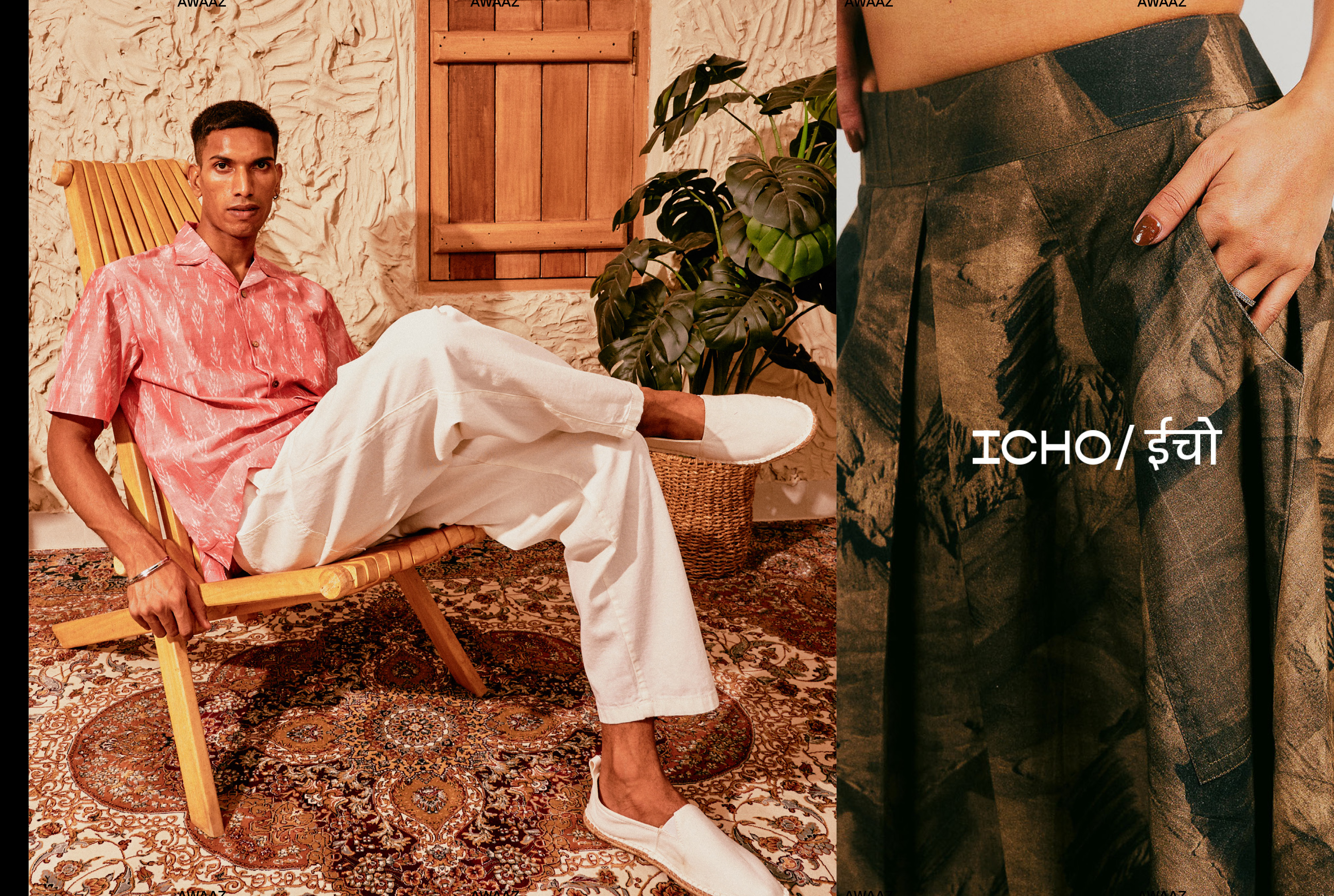
Ishika Madaan
Awaaz
[SC] Hi Ishika, how have you been lately? How has life in New Delhi been for you?
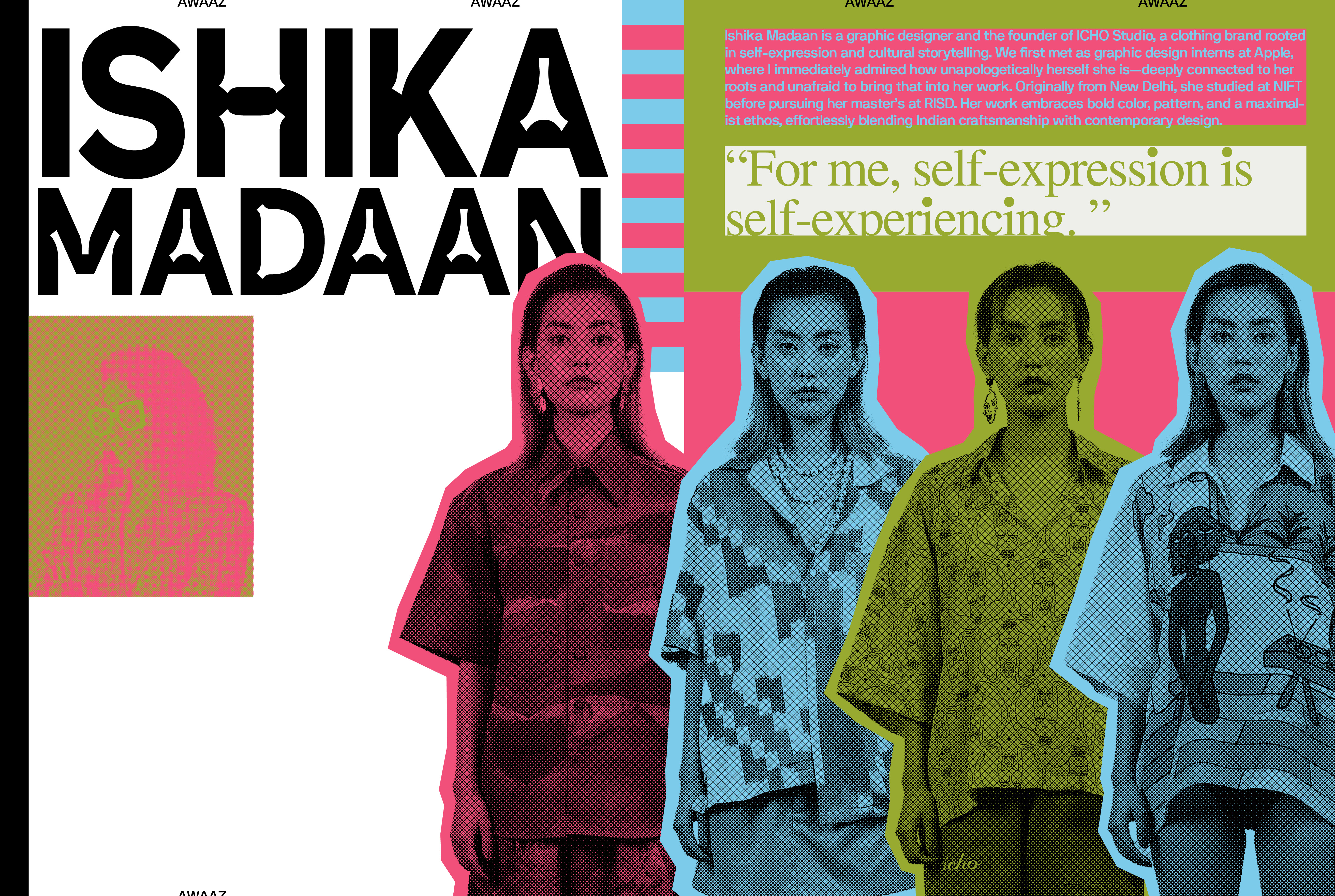
[IM] Life in New Delhi has been quite dynamic! After moving back from the US, I’ve been balancing multiple projects—working as a Creative Consultant at Apple India, planning my future steps, and continuing to build on ICHO. It’s been a shift and I’m taking it one day at a time.
[SC] From the little time I’ve known you, it’s clear that self-expression is at the core of both your personality and your work. From fashion to photography to design, you embrace so many ways of creating. What draws you to this kind of expression?
[IM] That’s a good observation! For me, self-expression is self-experiencing. I like to experience and explore different mediums of doing things, whether through design, photography, or other forms of creativity. Each medium offers a new way to think, interact, and problem-solve, and that process excites me. At times, my self-expression is also rooted in efficiency and problem-solving. This is where I enjoy the interplay of logic and creativity—figuring out how things work, how they can be improved, and how different disciplines intersect. My curiosity naturally leads me to explore multiple mediums because I thrive on variety, and I like to keep my work dynamic.
I see design as a tool for communication rather than just a discipline, so whether it’s branding, textiles, or digital work, the bigger picture is always my North Star. Everything I create connects back to a larger purpose in my own life—whether it’s understanding my cultural identity, solving a challenge, or simply following my curiosity. That guiding principle helps me navigate the different ways I choose to express myself.
[SC] That throughline definitely shows up in ICHO, too. I’m such a big fan of the work you do with your brand. Your textile designs are incredible, from material choices to the range of styles. I especially love the ‘Playground’ collection from 2022. Do you feel your approach to color is intuitive because of the design vernacular you grew up with in India?
Thanks, that means a lot and absolutely, our surroundings and environment shape how we see things, whether positively or negatively. I’ve always enjoyed playing with color in my work—creating fun palettes and bold compositions—yet my personal wardrobe is mostly earthy and neutral tones with the occasional pop of color.
Back at NIFT Delhi, a professor once told me my work was ‘too much’—essentially tacky—and suggested I tone it down. But after graduating, I worked with NorBlack NorWhite, which, as you know, is an explosion of color, textures, and patterns. Their boldness and confidence were a reality check for me—that creativity can be this too, and there’s no need to confine yourself to arbitrary rules.
Funnily enough, when I was at RISD, a professor praised my use of color so much that she brought me on as a Teaching Assistant for her color class! It was a full-circle moment, proving that taste is subjective and largely shaped by what we’ve been exposed to—much like most things in life.
[SC] Oh, I love a full-circle moment like that. It also makes me think about how creative instincts can evolve so much depending on who’s encouraging them. While formal training certainly refines this, and critiques are invaluable, I also believe there’s a part of design we just know because of where we come from. Are there aspects of your practice that you feel you know from instinct rather than formal training?
[IM] I believe our taste—at least in my case—is shaped by the things we’re exposed to and the experiences we’ve had. Formal training expands that exposure, introducing you to design solutions that have succeeded in the world.
Of course, one could argue that this also comes with its limitations. Many design schools (though not all) base their references and study materials largely on European designers, which can create a narrow perspective. But at its core, design is a visual language, and you have to stay true to what excites you. Over time, it’s about training your eye—learning to see details, colors, forms, and patterns more critically.
For me, complementing my own curiosity and research with formal training has shaped the way I approach design. Another major benefit has been learning the lingo of the design world—how to talk about my work, explain my choices with clarity, and present ideas with confidence. You know what I mean?
[SC] That makes a lot of sense. At the same time, I’ve been reflecting on how design education often leans so heavily on Western references. It can be subtle, but when you grow up seeing design differently, it’s hard not to notice. Have you ever felt that tension in your own education? Are there things you wish had been taught differently to better reflect non-Western perspectives?
[IM] I’m totally with you on this—I briefly touched on it in my previous answer! The dominant design discourse, especially in academic settings, is still very Western-centric. Aesthetic principles, historical references, and even the way critique is framed often stem from a Euro-American perspective. This can make anything outside of that framework feel like an “alternative” rather than an equal.
At RISD, our cultures and histories were much appreciated, so in that way, it was a very welcoming environment. That said, design education at large still has work to do—it should acknowledge and integrate non-Western perspectives not just as a niche area of study but as an essential part of the global design conversation. The key is to create a space where multiple perspectives can coexist and thrive.
[SC] Switching gears a bit—ICHO is such a compelling blend of craft, storytelling, and entrepreneurship. And I saw it began during the pandemic! What sparked the idea at that time? Was it overwhelming to manage the creative and business sides all at once?
[IM] ICHO wasn’t part of some long-term plan; It was born out of an opportunity. The pandemic forced a pause, giving me time to reflect on what I wanted to create. I had a lot of interests—textiles, photography, website design, typography, storytelling, entrepreneurship—and ICHO became a way to bring them all together.
[SC] Totally—running a business at 15 vs. during a global crisis, very different ballgame haha. But it also seems like you’ve always had an entrepreneurial spirit. Has that always gone hand-in-hand with your creativity?
[IM] Bringing entrepreneurship and creativity together wasn’t entirely new to me. I dabbled in both as a kid, and the business thinking came naturally—at least, what was required when I was 15. Managing both the business and creative sides was fun; I love numbers and problem-solving, so figuring out logistics, sourcing, and production was an exciting challenge. But turns out, running a business is not the same as selling cupcakes as a 15-year-old... who knew? LOL.
Ananya Mohan
Awaaz
[SC] Hi, Ananya! Thank you so much for participating in this interview. How are you doing lately?
[AM] Hi Shivangi! Thanks so much for having me, I love your work! Recovering from a flu so a bit sniffly still, but alive!
[SC] I’ve been following your work for a while, and I was actually surprised to realize that many of the projects I admired were all from you! Your sensibility of color is immediately something that drew me to your work when I first came across it. Do you think your use of color has been influenced by growing up in high-context culture places like India and Hong Kong?
[AM] Oh no way that’s so interesting hahah. That’s so kind of you to say that! Thank you for asking this – colour is something I absolutely adore working with. As a child as well I think I was just naturally inclined towards colour, how could I not be? Hong Kong’s urban landscape has this dynamic vibrant energy, whereas India is of course so rich and culturally rooted in so much colour. I was fortunate to grow up in lively, bustling, and vibrant places and this mix of cultures that allowed me the eye to play with colour in a big way. Specially after moving to Hong Kong when I was 8, it just gave me a lot of exposure in terms the way I looked at design in general. Also so much of the media that I consumed as a kid, movies, graphic novels, music, etc., think it all contributed to that!
[SC] I definitely see that in your work. I feel like so much of our design work is almost a subconscious reflection of our backgrounds. There’s a little bit of myself and where I come from in everything I make, irrespective of the subject matter. Do you see parts of you in your design as well? How do you balance your own visual instincts with the expectations of large-scale brands like Nike?
[AM] You’ve worded this approach to your practice so well, I resonate with that deeply! Of course, I don’t think it’s always a conscious decision, but yes, I tend to somehow bring punchy visual elements into the work. I’m also a very instinctual designer, and I often get told by my colleagues about how I “design off of vibes” and how my visual instincts seem to always overpower and come in the way of designing big client work! It’s good to have a strong visual style but it’s also important to know when to hold off as it’s not always appropriate for clients that have a visual brand of their own. In scenarios like these, I’ve been told to think conceptually and strategically first and foremost, always, as that’s the idea and “story” that clients will buy into, not a visual aesthetic.
[SC] I get that! Parts of you just find their way into everything you make. Speaking of client work, I’ve heard that NOT Wieden+Kennedy operates very differently from other traditional branding agencies. In your experience, have you noticed a shift in how bigger brands are approaching cultural storytelling? Do you feel like there’s more space now to challenge Eurocentric design norms, or do the same biases persist?
[AM] There is definitely more space for cultural storytelling to be inclusive. It’s also difficult knowing when it’s done genuinely and when it’s done just for the “look”. I would always voice for not just pushing more “diverse looking” work out, but also hiring more people from a diverse range of backgrounds in not just culture but also class. Embracing different perspectives is key to creating genuinely more interesting work.
I think there was definitely a shift just post-2020 during the Black Lives Matter moment, pushing brands to take accountability, think, and question these norms and approaching cultural storytelling. We definitely see a lot more work that uses non-Eurocentric visuals. I feel like it’s also good to question whether the people behind the non-Eurocentric “diverse” work are people of colour themselves, or non-PoCs making the work purely for the aesthetic. Perhaps I’m cynical but I do feel like the shift of challenging and questioning these norms may have died down a little bit?
A personal pet peeve of mine is when I see brands or people using material/ typography from a different script and culture solely for an aesthetic reason, and in doing so, ending up spelling the material wrong because Google Translate doesn’t always do it right. Sorry I think I’ve gone on a little tangent here!
[SC] Totally. I know for me, I sometimes struggle with Hindi typography—finding good options can be tricky! I loved how you made a default Devanagari typeface look so good in your Independence Day poster. Was that a challenge? How do you navigate the constraints of Hindi typography, and do you think the lack of diverse type options affects how Indian languages are visually represented in contemporary design?
[AM] I’m a big fan of using “default” typefaces for most of my work actually! I’m quite boring in the sense that I tend to gravitate towards using Helvetica/ Neue Haas or Times New Roman when working with Latin often. Similarly, with Hindi as well, I’ve used a default Devanagari typeface. Thank you for your kind words about this! This was a little poster I did for an internal work event. Didn’t really think too much or spent too much time on it (it was also a few years ago!), but really enjoyed the quick process and the outcome. I think a lot of my favourite pieces of work are shorter stints that I do instinctually. Sorry I’ve gone off another tangent here!
To answer your question, I think there are lot of amazing Devanagari type designers out there (Universal Thirst, Shiva Nallaperumal) but definitely wish there was a bigger selection of typefaces out there that were experimental. This is probably why we see Devanagari almost always seen as a type of serif in contemporary design. Or how we see a certain type of Arabic, when in reality there’s plethora of a few different types of Arabic scripts.
[SC] You know, speaking of another Devanagari project of yours—one of my favorite projects you did is the collaborative zine, 3rd Brow, with Mohammed Samad—it’s one of the most unique takes on Bollywood in graphic design I’ve seen! What inspired this project, and how did your collaboration with Mohammed shape it?
[AM] Thank you, it was a fun one! This project was a result of me talking Mo’s ear off about my Bollywood knowledge in music samples etc. (Ek Duuje Ke Liye featured in the zine was sampled in Toxic by Britney Spears!), while him at the time not knowing much about Bollywood at the time. Watching snippets of those films we noticed the iconic facial hair in a lot of the older movies, and this came about 3rd Brow. Mo and I are quite aligned in our tastes, he also is incredibly talented and has immense typographic knowledge, so this was a fun project to work on together.
Mom
Grass Between The Stones
[SC] Do you think a lot has changed since the city was originally built?
[Mom] I think the government and the administration have tried to retain the essence of the city over the years. In an attempt to modernize and urbanize, and keep up with the time period—I feel like a lot of Indian cities like Delhi lost a lot of history. They compromised on their essence. But Chandigarh still feels like it retains its ethos from its earliest days.
[SC] Can you talk a little about the history of the city and what it means to you?
[Mom] When I talk to my friends who are from old cities—like Patna, or Banaras, or Jaipur—their cities have a lot of culture to offer. The city is ingrained in you somehow. But Chandigarh is a very new city. It’s almost as old as us, a little older by maybe 10 years. So, I feel like there is no history to the city. Maybe that is the history—that it has none, because it was our present. We’re creating the history—our generation—it is us who are writing it each day. We’re the lucky ones who get to grow old with the city, which I find very interesting. Maybe one day the city will have stories about us, you never know.
[SC] What’s your favorite memory in the city?
[Mom] One of my favorite memories is of going on strolls with my mom and my brother to the Lake on Sunday mornings. We would go for cute little picnics there on an early morning walk. Or maybe our leisure strolls at the Rose Garden—there used to be a balloon vendor outside. And also, the 17 Plaza Carnival—the Central Atrium in Sector 17—we used to really look forward to getting ice-cream there. I long for those memories—that was a really cute part about growing up here. The sweetest memories I have are of that area.
[SC] What are some places of personal significance to you?
[Mom] This is a very emotional question for me. Like for any child, there are moments in your childhood that were key turning points. Some memories are so ingrained from your childhood. So, when my mother was unwell, the PGI hospital became one institute that we used to frequent a lot. In spite of the fact that it has its flaws—there are a lot of people, you need contacts for the healthcare to be efficient—but even today, I feel like the people there have given me so much hope. The doctors there are very, very committed to their jobs. PGI holds a lot of significance to me.
Dad
Grass Between The Stones
[SC] How long have you lived in Chandigarh? Do you feel like a lot has changed in your time living here?
[Dad] I remember the days when I used to go out for dinner with my father and mother to a restaurant—any every table had someone known to us. It’s such a small city that everyone knew everyone. Even today, there are maybe 400-500 families, the “old-timers” that have lived here their whole lives, and so they’re a part of every social gathering in Chandigarh. And they know each other—everyone knows them. They don’t need an introduction. It’s such a peculiar thing that can only happen in Chandigarh. This can never happen in a metropolitan city.
Now, I feel like there are so many new faces. There are so many people who want to move here—from Himachal, from Punjab, Delhi, from the South, and even from Canada. It’s become a place with a lot of different cultures because so many people have moved here.
[SC] Do you feel like the modernist architecture affects your everyday living? Is it strange that everything is perfectly gridded?
[Dad] It’s very interesting that you don’t need to know the directions to anywhere when you drive in this city. Even when Google Maps didn’t exist, if you know the general direction of a sector, you will get there somehow. You can take any road towards the area, and because it’s a perfect grid, you will reach there eventually. Like the city is divided into sectors, the sectors are divided into quadrants—A, B, C, D.
[Mom] Yes, like, 1500+ numbers will be in D. 1000-1500 will be in C, so it is a very intuitive system.
What are some places of personal significance to you?
[Dad] I have a lot of memories of Sector 17 and going there with my parents—for shopping, or a little stroll, or ice-cream in the evenings. I have very pleasant memories of walking around there with a vanilla cone in my hand. I used to get 1 scoop and my dad would get 3, which I thought was very unfair. I have so many fun memories of that place that I wish I could go back to.